Welcome to our blog series on Creative Services for Interactive Kiosks. I’m Jeff LeBlanc, the director of User Experience (UX) here at Advanced Kiosks. One of my favorite parts of my job is writing about how design best practices can improve lives. The right touch screen kiosk interface design can make all the difference for your customers, employees, patients, visitors and guests.
Digital Kiosk Industry Growth & Evolution
Electronic kiosks are playing a larger role in people’s lives every year. Already a $23 billion industry, the interactive kiosk market is expected to exceed $31 billion by 2024. The frequency at which people encounter computer kiosks in their everyday life is increasing accordingly. In fact, it’s difficult to not interact with kiosks these days. From printing tickets or boarding passes, to purchasing items at the store, to experiencing rich media content in a museum exhibit, computer kiosks are quickly becoming an invisible part of everyday life. This growth provides an excellent opportunity to talk about design in the real world.
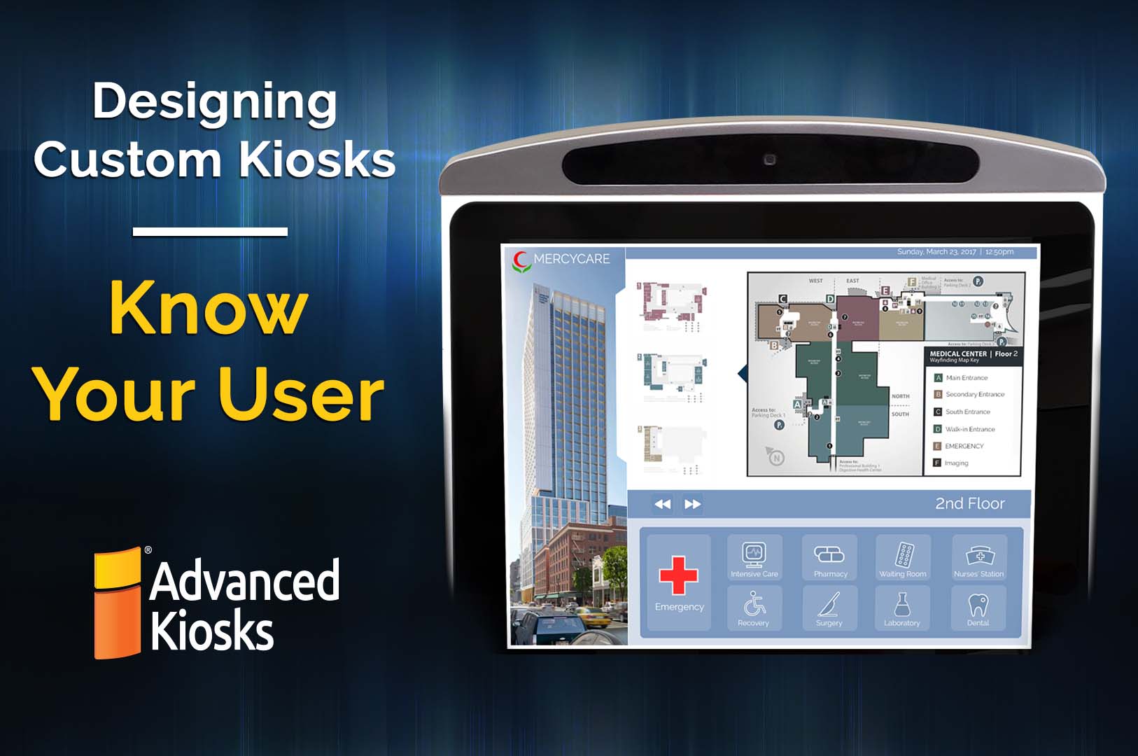
As the self-service kiosk industry matures, there is a greater awareness of the need for comprehensive user interface design. Traditionally, the focus has been on designing the physical device, leaving the pixels on the screen as a secondary concern. Many companies have rolled out a comprehensive deployment plan for the metal boxes, and then simply put their website on the touch screens. These deployments often end in failure, with the machines sitting unplugged in the corner of the room because nobody liked using them.
This is where user experience (UX) design makes all the difference.
Designing a custom kiosk is no more difficult than designing any other interactive system or Internet of Things (IoT) device, but it is a slightly different problem. Recognizing that difference is the first step to a successful deployment. As Sandnes et al note, many designers often transfer their web or desktop designs directly to the touchscreen kiosk, and that is where the problems start.
Know Thy Kiosk User
Back in 1971, UX design discipline pioneer Wilfred Hansen established a fundamental principle: “Know thy user.” This is the critical first step in designing any form of system, whether it’s an interactive kiosk or mobile website. A designer has to know and understand who will be using the system: the range of demographics, technical skills, probable mindsets, and even under what environmental conditions the interactive kiosk will be used. We’ll discuss the ramifications of each of these considerations in a future article. For now, we must keep in mind that, in the majority of situations, the user of a digital kiosk is often a first-timer. So the design should be intuitive — easily usable with no outside assistance — to be successful.
Once you know your users, it’s time to determine the digital experience you want them to have. Here’s where business goals come in; they must be understood and addressed during the design process. Do you need to minimize friction or maximize appeal? When deploying ticketing kiosks, the usability of the system is paramount. The goal is to get people through the ticketing process quickly and easily. But an informational kiosk in a museum exhibit must be both usable and engaging, so the user gets the info they desire and wants to interact further. If the digital kiosk is to be used in a purely experiential situation, such as a marketing event or trade show, then the design has to maximize that sense of fun and coolness the interaction brings. Sometimes it really is all about the “wow factor,” or as it’s called in UX design, the visceral response.
Kiosk UX Combines Digital & Physical Experience
The design of a digital kiosk is closer to the design of a mobile application than a website or desktop program. The kiosk user interface consists not only of the pixels on the screen, but also the form factor of the physical device and the environment that it will be used in. Knowing the intended use cases of your kiosk system, who the users are and what they want to do, will ensure the right design choices are made. Smart design leads to successful deployment.
If you’re looking to design a custom kiosk for a particular use case, reach out to us. In the coming weeks, we’ll be talking about everything from best practices in digital kiosk design, to emerging trends and technologies, to case studies about self-service kiosks in the field. The discussions will range from enlightening to informative to entertaining, and we hope you’ll come along for the ride.


