Kiosk design. There’s a lot that goes into it.
When designing a kiosk, you should think about the color, logo, and sculpture of the enclosure to decide what kiosk best fits your needs. What are you looking for? What problems will this kiosk solve? Deciding these things can help create a platform for the look you want to present to the intended users of the kiosk.
PICKING A COLOR FOR YOUR KIOSK DESIGN
Color means a lot when it comes to product design. The color you choose for your kiosk represents your business or organization. There are plenty of studies out there that suggest that there is a real strategy behind color psychology. We have a general understanding of color that is based on a collective experience of color association. If every time I go out to eat, and there is always red at every restaurant I go to, I will subconsciously connect the dots between the color “red” and “hunger”. Color association studies follow similar concepts to Pavlov’s Dog, which is an academically studied and strong theory.
To find out which color best represents your company go to: color quiz
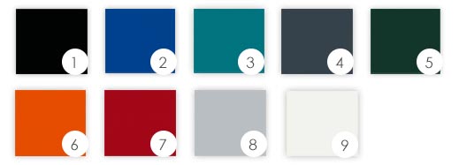
Available colors at Advanced Kiosks
ADDING YOUR LOGO TO THE KIOSK
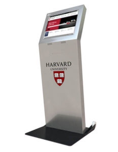
In this modern digital age, a logo design can either really help or really hurt you. A logo is the graphic a person sees in a millisecond and has already created an opinion about your company before even truly knowing what it is that your company does. That’s why a good logo is extremely important. It is a representation of the company, its values, and its personality, all in a small image that will be placed on almost anything you produce. In a way think of it as your organization’s signature. For the case of choosing your kiosk design, having a real solid logo is even more important because it typically can be the most prominent imagery on the kiosk, and the first thing the customer notices. If you haven’t created a company logo, or are looking to improve the design, here are some tips.
- Less is more: a simple design that gets to the heart of it all means more than a complicated, overdone design that distracts from the core value and meaning. Try and say what you need to say in a simple design.
- Adaptable: Another reason why simplicity is key in logo design. Make sure the logo can be put just about anywhere. It needs to be accessible to kiosks, shirts, bags, and billboards alike.
- Size: Create a design that can be small or large and still make the same impact on the consumer. Preferably, it would be a design that looks great when centered to a kiosk.
- Timeless: Designs that don’t have to change with time are some of the most effective designs because they transcend above “old news” designs. In other words, don’t create a logo based off of a meme or popular photo that may die down in the next month or so. You’ll have to keep re-creating logos to stay up to date with what’s popular.
- Audience: Know your audience, and create a logo that resonates with them. Think about who you are trying to reach and make the design process revolve around a dialogue with that person.
- Uniqueness: Be different. We don’t remember the mundane things we see every day. There are logos around us everywhere we go, so make sure that your design sticks out among the others.
Checkout this handy post for more tips on logo design: 65 expert logo design tips
ENCLOSURE
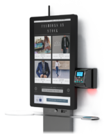
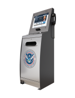
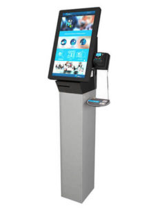
What kiosk manufacturer are you purchasing the kiosk from? Each manufacturer is going to have their own take on kiosk design. This can affect how the company is perceived through the kiosk. Go for the kiosk design that reflects the image you want your customers to have. If you want your company to exude elegance and excellence, then you may not want to purchase a bulky rectangle of a kiosk and go more for a sleek, curved design kiosk. If your company touts durability, you may want a kiosk just as durable to represent that ideal.

